Colour psychology in interiors goes far beyond choosing a beautiful wall or matching textiles with furniture. Colour influences the perception of space, the sense of temperature, mood and the way we inhabit a home. In architecture and interior design, every tone communicates something: calm, spaciousness, sophistication, energy, intimacy or balance.
In the south, especially on the Costa del Sol, this relationship between colour, light and architecture takes on particular importance. The intensity of natural light, the reflections of the Mediterranean surroundings and the presence of materials such as stone, limewash, wood and clay mean that colour decisions must be approached with sensitivity. Not all whites are the same under intense light, and not all dark tones create the same depth in a home that opens outwards.
At Alejandro Giménez Architects, we understand colour as an architectural tool. It is not about decorating afterwards, but about integrating the colour palette from the initial concept of the project, together with the layout, materials, light and relationship with the landscape.
What Is Colour Psychology in Interiors?
Colour psychology studies how colours can influence our emotions, behaviours and perceptions. Applied to interior design, it helps create spaces that are not only aesthetically attractive, but also coherent with the way their inhabitants live.
A bedroom needs to convey rest. A living room may seek spaciousness, serenity and conversation. A kitchen may need brightness, visual clarity and warmth. A study requires concentration, order and balance. Every room has an emotional function, and colour can either reinforce or contradict it.
That is why talking about colour in interiors does not simply mean thinking about paint. We are also referring to floors, joinery, fabrics, furniture, worktops, lighting, works of art and even the shadows cast by the architecture throughout the day.
Neutral Palettes: Serenity, Spaciousness and Timelessness
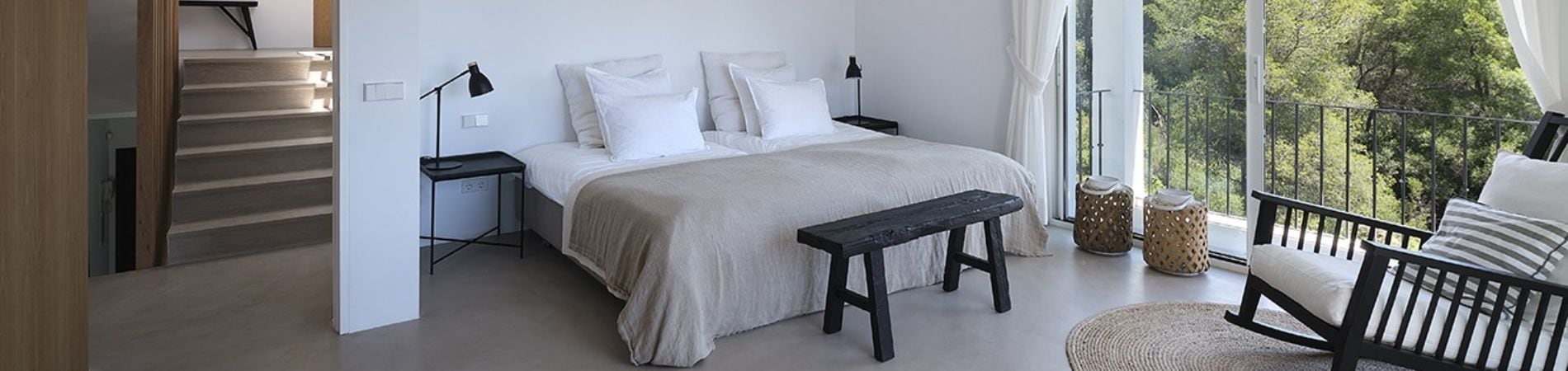
Neutral palettes are one of the great allies of contemporary Mediterranean architecture. Off-whites, sand tones, beiges, warm greys, soft stone shades and earthy colours make it possible to create calm, bright and lasting interiors.
Contrary to what is sometimes thought, a neutral palette does not have to be cold or impersonal. Its richness lies in its nuances. A pure white can feel excessively bright under southern light, while a warm white, with a slight cream or sand undertone, can create a much more welcoming atmosphere. Likewise, a cool grey can harden a space, whereas a stone grey can add elegance without losing warmth.
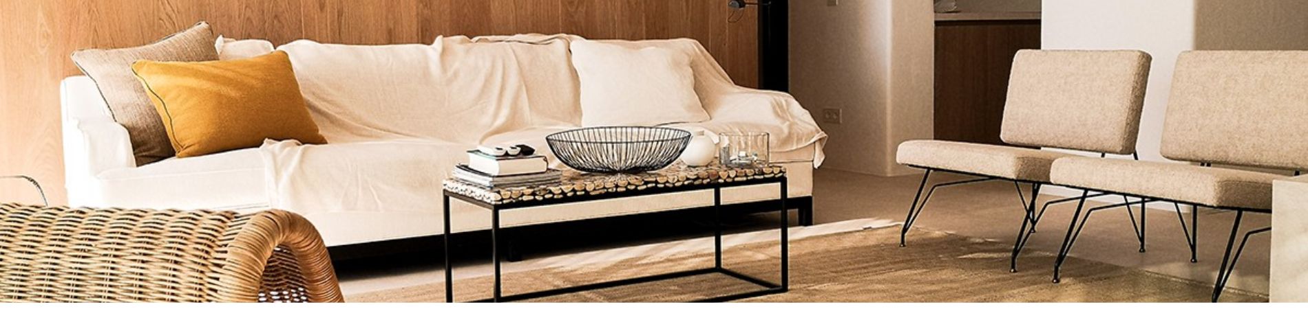
The key lies in working with layers: light walls, natural floors, textured textiles, wood, ceramics, plant fibres and small contrasts in specific elements. In this way, the interior gains depth without losing serenity.
In Mediterranean homes, neutral palettes work particularly well because they interact with the exterior. They do not compete with the blue of the sea, the green of the vegetation or the strength of the sky; instead, they frame them.
Contrast: How to Add Depth Without Breaking Harmony
Contrast is essential to avoid flat interiors. A completely neutral home can be elegant, but it also risks appearing monotonous if variations in tone, texture and shadow are not introduced.
Contrast does not always have to be extreme. It can appear in dark wood joinery, a piece of art, a sculptural lamp, a stone worktop, a textured wall or a handcrafted floor. What matters is that it has intention.
In colour psychology in interiors, contrasts help guide the eye and establish hierarchy within the space. A light background with a dark element can add sophistication. A warm atmosphere with small black accents can gain character. A bright room with natural materials can be balanced with terracotta, olive or clay tones.
Contrast can also be used to create different areas within the same home. In open-plan spaces, for example, a subtle colour variation can distinguish the dining area from the living room without the need to build partitions. In this way, colour becomes an architectural tool for organising the experience of space.
The Influence of Southern Light
Southern light has a personality of its own. It is intense, changing and generous. For much of the year, it enters homes powerfully and transforms colours throughout the day. A shade that appears soft on a sample may look much lighter in a south-facing room. A warm colour can intensify at sunset. A white that is too pure can cause glare.
That is why, in interior architecture, it is essential to test colours in the real space and observe them under different lighting conditions. Morning, midday and afternoon can offer very different readings of the same palette.
In areas such as Marbella, Estepona and Sotogrande, natural light should not be treated as a simple functional resource. It is part of the project. It can enhance a texture, soften a volume, cast shadows or turn a neutral wall into a living surface. The perspective of an architect in Marbella makes it possible to integrate that light into the design from the outset, taking into account orientation, materials, openings, circulation and atmosphere.
Warm Colours and Natural Materials
Warm tones have a direct relationship with the feeling of home. Sands, earth tones, soft ochres, muted terracottas and natural browns evoke stability, closeness and comfort. When combined with authentic materials, such as wood, stone, linen, limewash or ceramics, they create interiors with identity and emotional depth.
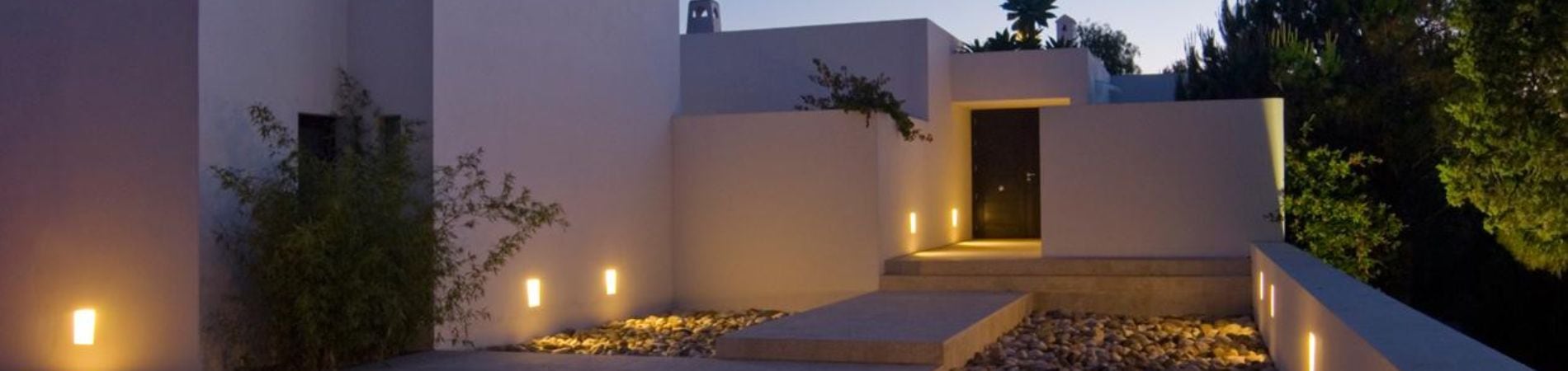
In Mediterranean architecture, these colours connect with tradition without giving up a contemporary interpretation. It is not about reproducing old styles, but about reinterpreting the essence of the place: the calm of whitewashed walls, the texture of handcrafted materials, the shade of patios, the freshness of open spaces and the warmth of a home designed to be lived in.
Colour psychology in interiors finds a very interesting balance here: discreet colours, but with memory; soft tones, yet full of presence; serene spaces, but never empty.
Cool Colours: Freshness, Balance and Visual Pause
Cool colours, such as blues, soft greens and blue-toned greys, can bring freshness and balance, especially in warm climates. However, they must be used with precision so as not to cool the atmosphere too much.
A soft olive green can connect with the landscape and bring calm. A greyish blue can evoke the sea without falling into an overly literal aesthetic. A stone shade with a cool undertone can work in bathrooms, bedrooms or relaxation areas if balanced with wood, natural textiles or warm lighting.
The choice does not depend solely on the colour, but on its context. A cool tone in a very bright home can feel refreshing. The same shade in a room with little light can appear dull. That is why architecture, orientation and decoration must work together.
How to Choose a Colour Palette for a Home
Before choosing colours, it is worth answering several questions: what feeling do we want to create? How does the light enter? Which materials will remain? What views does the home have? What lifestyle do its owners have?
A good colour palette usually starts from a neutral base, incorporates natural materials and reserves accents for strategic points. It should also maintain continuity between rooms, especially in open-plan homes. This does not mean that every space must be the same, but there should be a common thread.
Colour should accompany the architecture, not compete with it. If a home has large windows, patios, natural textures or strong volumes, the palette should reinforce these elements. If the space needs more character, contrast can be introduced with precision.
Conclusion: Colour, Light and Emotion
Colour psychology in interiors is an essential tool for creating more human, balanced and coherent spaces. In Mediterranean homes, where southern light has such a strong presence, choosing colours well means understanding how they change, how they interact with materials and how they influence everyday life.
Neutral palettes provide calm and timelessness. Contrast introduces depth and character. Natural light transforms every surface. When these elements are worked on together, the result is not just a beautiful interior, but a home with soul, designed to move, soothe and endure over time.